OKHST: predictable color generation for user interfaces
Wouldn’t it be great if one hue slider could recolor an entire interface, while a saturation slider controlled how colorful the whole system felt?
I don’t mean a beautiful gradient or a decorative palette. I mean the boring parts of an interface: backgrounds, text, borders, hover states, selected states, disabled states, shadows, dark mode, and high contrast.
The premise sounds simple: pick a hue and saturation, then derive everything else. I chased that idea through several color spaces before finding the assumption that kept breaking it:
lightness is not contrast.
OKHST is the coordinate system I eventually built around that distinction. A CSS playground later in the article tests the model in the browser, while Glaze turns it into a production system.
The Old Attempt
About seven years ago, I tried to generate UI colors at runtime. Instead of hand-picking every token, the framework would take a small set of inputs and derive a complete scheme. HSLuv made the experiment possible.
HSLuv gave me something regular HSL did not: a perceptually useful lightness axis. In regular HSL, 50% lightness can mean wildly different things for yellow, blue, red, and green. HSLuv made “make this lighter” and “make this darker” much closer to operations a UI system could rely on.
I spent months tuning formulas around it. Eventually, tiny declarations could color different parts of an interface while the framework kept the palette consistent. The result was good enough for production, and it was one of the most fun things I had built at the time.
The old demo is still online: theme.tenphi.me
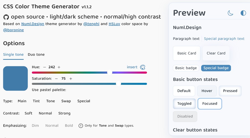
But the system was coupled to one design system, embedded in our framework, and tuned for one product. HSLuv was also still immature, so several inconsistencies needed local workarounds.
The experiment convinced me that UI colors could be computed, but it never became a reusable tool. I kept using HSLuv, stopped shipping generated palettes, and waited for a reason to revisit the idea.
The Web Caught Up
That reason arrived with OKLCH in CSS. It gives the web a modern perceptual color space and makes many color operations more sensible than HSL ever could. But direct palette generation remains difficult because C is absolute chroma, not the relative “saturation” control people expect when authoring UI colors. The maximum possible chroma changes with hue and lightness, so keeping chroma fixed while changing lightness can push some colors outside sRGB and cause clipping.
/* Same chroma, different lightness.
   Some hue/lightness combinations may clip in sRGB. */
.step-1 {
  color: oklch(35% 0.18 250);
}
.step-2 {
  color: oklch(65% 0.18 250);
}
.step-3 {
  color: oklch(85% 0.18 250);
}
Manual palettes can work around this: pick each value by eye and adjust the outliers. Dynamic themes cannot do that so easily. When a background, text color, border, shadow, and hover state all derive from one source color, clipping silently changes the relationship between them. A generated ramp can look fine in the middle and fall apart near the edges.
Modern relative colors make the approach especially tempting:
.card {
  --bg: oklch(65% 0.18 250);

  background: var(--bg);
  color: oklch(from var(--bg) 25% c h);
  border-color: oklch(from var(--bg) calc(l - 0.12) c h);
}
The relationship is elegant, but the same absolute chroma follows the background into each new lightness value. A generated palette can therefore drift or clip. What I needed was a saturation axis relative to the maximum chroma available at each hue and lightness.
OKHSL Gets Saturation Right
OKHSL provides that missing axis. It has the familiar shape of hue, saturation, and lightness, but builds it on OKLab/OKLCH math. Its saturation is normalized against what is possible for the current hue and lightness.
Near white and black, where highly saturated colors cannot physically exist in sRGB, OKHSL desaturates gracefully instead of clipping unpredictably.
This graceful behavior is what a generated UI palette needs.
// Illustrative pseudo-code, not a real library call.
// Same saturation, different lightness — OKHSL keeps it in-gamut.
okhsl({ h: 250, s: 70, l: 20 });
okhsl({ h: 250, s: 70, l: 50 });
okhsl({ h: 250, s: 70, l: 90 });
In OKHSL, 70% saturation means something like:
Use 70% of the chroma available for this hue and lightness.
That is much better for generated UI colors than:
Use this absolute chroma value and hope it still fits.
OKHSL is limited to sRGB, which may sound disappointing in a world of wide-gamut displays. For core UI, I often find that constraint useful: repeated text, icons, and borders benefit from a conservative, in-gamut default. Wide-gamut color still has a natural place in illustrations, decorations, and brand moments.
The Bug in My Mental Model
OKHSL solved the gamut problem, but not the relationship problem. My palettes still felt wrong in places because I was treating a color’s lightness as if it described its contrast against another color.
Dark mode exposed the mismatch first. Inverting lightness produced a coherent palette, but the contrast felt weaker than expected, so I added a separate transformation curve. Then very dark colors in a light scheme also moved differently from what I expected. The curve had only hidden the underlying mistake.
// Nice idea, weak invariant:
const dark = { ...light, l: 100 - light.l };
Perceptual lightness describes how light or dark an individual color appears. UI contrast describes the relationship between two colors, and equal lightness changes do not produce equal contrast changes across the range.
A simple way to see it is to compare a tiny step near black with the same tiny step near white.
Near black: l = 0, 1, 2, 3, 4
Near white: l = 96, 97, 98, 99, 100
The numeric movement is the same. The contrast between adjacent steps is not.
<div class="ramps">
<div class="row row--dark">
  <span class="row-label">Near black</span>
  <div class="steps">
    <div class="step" style="background:oklch(0% 0 0)"></div>
    <div class="step" style="background:oklch(1% 0 0)"></div>
    <div class="step" style="background:oklch(2% 0 0)"></div>
    <div class="step" style="background:oklch(3% 0 0)"></div>
    <div class="step" style="background:oklch(4% 0 0)"></div>
  </div>
</div>
<div class="row row--light">
  <span class="row-label">Near white</span>
  <div class="steps">
    <div class="step" style="background:oklch(96% 0 0)"></div>
    <div class="step" style="background:oklch(97% 0 0)"></div>
    <div class="step" style="background:oklch(98% 0 0)"></div>
    <div class="step" style="background:oklch(99% 0 0)"></div>
    <div class="step" style="background:oklch(100% 0 0)"></div>
  </div>
</div>
</div>html {
color-scheme: light;
}
body {
margin: 0;
}
.ramps {
display: flex;
flex-direction: column;
gap: 0;
border-radius: 6px;
overflow: hidden;
}
.row {
display: grid;
grid-template-columns: 5rem minmax(0, 1fr);
align-items: center;
gap: 0.5rem 0.75rem;
padding: 1rem 1.25rem;
}
.row--dark {
background: #000;
}
.row--light {
background: #fff;
}
.row-label {
font:
500 0.75rem/1 ui-monospace,
monospace;
}
.row--dark .row-label {
color: rgba(255, 255, 255, 0.72);
}
.row--light .row-label {
color: rgba(0, 0, 0, 0.55);
}
.steps {
display: grid;
grid-template-columns: repeat(5, minmax(0, 1fr));
gap: 0.35rem;
min-width: 0;
}
.step {
height: 2.75rem;
border-radius: 4px;
}
.row--dark .step {
border: 1px solid rgba(255, 255, 255, 0.14);
}
.row--light .step {
border: 1px solid rgba(0, 0, 0, 0.12);
}Near black, two neighboring steps barely separate. Near white, the same gap reads as a clear jump.
You can also measure the failure across the whole range. Here is WCAG contrast for a neutral ramp with equal lightness steps of +20:
| Lightness | vs black | vs white | +20 step × | | --------: | -------: | -------: | ---------: | | 0 | 1 | 21 | 1.55 | | 20 | 1.55 | 14 | 2.09 | | 40 | 3.23 | 6.50 | 2.05 | | 60 | 6.64 | 3.16 | 1.86 | | 80 | 12 | 1.70 | 1.70 | | 100 | 21 | 1 | — |
The numeric steps are identical, but the contrast multiplier between adjacent steps drifts from 1.55× up to 2.09× and back down to 1.70×. This variation makes lightness a poor authoring axis for things like borders, hover states, shadows, and dark-mode inversion.
I needed an authoring axis where a numeric step described a stable change in UI contrast. That axis became tone.
OKHST
Tone is a 0-100 authoring axis designed so that equal differences produce equal contrast multipliers along the neutral axis. A +20 step should describe the same relative change whether it starts near black, in the middle, or near white.
OKHST keeps OKHSL’s hue and saturation and replaces lightness with that tone axis. Under the hood, tone is a monotonic remap of OKHSL lightness: a given tone always maps to the same lightness at every hue and saturation. Every OKHST color is therefore a valid OKHSL color and inherits its gamut behavior and reversibility.
The remap uses a normalized logarithm of luminance, offset by the same 0.05 used in the WCAG contrast formula:
tone(Y) = 100 * (ln(Y + 0.05) - ln(0.05)) / (ln(1.05) - ln(0.05))The shared offset gives tone its useful behavior. WCAG contrast is (Y_hi + 0.05) / (Y_lo + 0.05), so for neutral colors a fixed tone difference corresponds to a fixed contrast ratio, no matter where on the scale it sits.
Here is the same measurement as before, but with equal tone steps instead of equal lightness steps:
| Tone | vs black | vs white | +20 step × | | ---: | -------: | -------: | ---------: | | 0 | 1 | 21 | 1.84 | | 20 | 1.84 | 11 | 1.84 | | 40 | 3.38 | 6.21 | 1.84 | | 60 | 6.21 | 3.38 | 1.84 | | 80 | 11 | 1.84 | 1.84 | | 100 | 21 | 1 | — |
Each +20 tone step multiplies contrast by exactly the same factor — 1.84×. Plain lightness does not provide that property.
Tone lets states be authored as deltas instead of independent colors:
// Illustrative pseudo-code, not a real library call.
const primaryTone = 62;
const hoverDelta = 6;

const primary = okhst({ h: 250, s: 70, t: primaryTone });
const hover = okhst({ h: 250, s: 70, t: primaryTone - hoverDelta });
The same pattern can describe tints, shades, borders, and shadows.
Tone provides a reliable starting relationship, not an accessibility guarantee. The fixed relationship is exact for neutral colors; once saturation enters, rendered sRGB luminance can drift from that neutral prediction. A required contrast floor still has to be checked with WCAG or APCA against the final rendered color pair.
Even with that boundary, a methodology can say “move tone by this much” and produce a consistent starting point instead of searching for every color independently.
OKHST is not a universal color science breakthrough. It is a practical coordinate system for generating UI palettes.
The full specification is here: github.com/tenphi/okhst
Scheme Mapping
OKHST defines a color coordinate:
hue, saturation, toneA coordinate alone does not define a theme. The interface adds a separate scheme layer that decides how authored tones behave in light, dark, and high-contrast modes. That layer has three parts: tone windows, tone deltas, and local tone flips.
A tone window maps the authored 0-100 range into the endpoints a scheme should actually use. For a light scheme, I might use 10-100: pure white surfaces remain available, while text avoids unnecessarily harsh black. A dark scheme can invert tone and map it into 15-95, avoiding both black surfaces and pure white text. High contrast usually opens the window to the full 0-100 range.
A tone delta defines how far a color sits from its parent: a border might be 14 tones away from its surface, for example. Opening the window preserves that distance, so a subtle border remains subtle. High contrast can widen the deltas to pull borders, muted text, and accents further from the colors beneath them.
A local tone flip lets one region reverse direction without changing the whole scheme. The surrounding interface may follow dark mode while an accent region keeps its original direction.
Together, these parameters let one authored palette serve light, dark, and both high-contrast variants instead of becoming four separately maintained palettes. They are theme logic layered on top of OKHST, not part of the color space itself.
With the two layers separated, the next question is whether CSS can preserve their relationships at runtime.
Can This Run in CSS?
The playground keeps the OKHST primitive and its scheme logic live instead of flattening them into static values. Modern Chromium-based browsers are starting to support CSS @function, which allows custom functions with real calculations. This new primitive made an unreasonable experiment possible:
Can OKHSL and OKHST conversion run directly in CSS?
The answer is yes. The functions port OKHSL’s gamut-normalized saturation and emit standard oklch() colors without a JavaScript runtime.
I built a playground here: tenphi.github.io/okhst
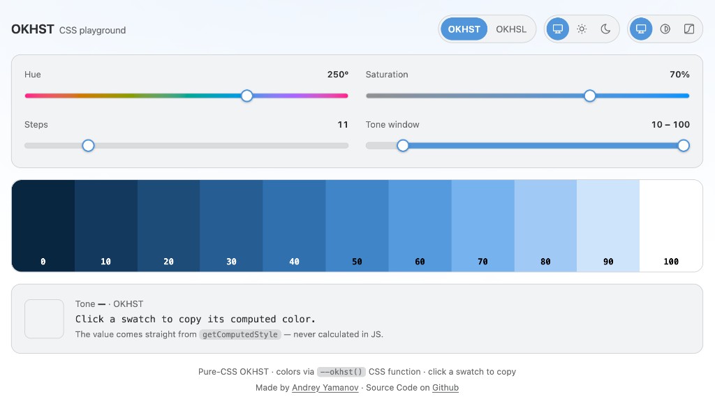
The implementation exposes two functions:
/* Raw OKHST primitive: direct hue/saturation/tone conversion. */
--raw-color: --okhst(var(--seed-h), var(--seed-s), 62);

/* UI helper: maps tone into the active scheme before resolving OKHST. */
--ui-color: --ghst(var(--seed-h), var(--seed-s), 62);
--okhst() is the color-space primitive. The scheme-aware --ghst() helper applies the current tone window and optional flip before calling it.
The playground UI uses the same system as its swatches. Changing hue, saturation, scheme, or tone window also changes the interface around the ramp. The two sliders from the opening are now working: hue chooses the color family, saturation controls its intensity, and the UI follows.
The surrounding interface uses the same seed as the swatches. Each color is authored as a tone delta from the surface:
:root {
  --seed-h: 250;
  --seed-s: 70;

  /* tone deltas: how far each color steps away from the surface */
  --d-elev: 4;
  --d-border: 14;
  --d-text: 94;
  --d-muted: 62;
  --d-accent: 42;

  --c-surface: --ghst(var(--seed-h), 4, 100);
  --c-elev: --ghst(var(--seed-h), 5, calc(100 - var(--d-elev)));
  --c-border: --ghst(var(--seed-h), 4, calc(100 - var(--d-border)));
  --c-text: --ghst(var(--seed-h), 2, calc(100 - var(--d-text)));
  --c-muted: --ghst(var(--seed-h), 2, calc(100 - var(--d-muted)));
  --c-accent: --ghst(var(--seed-h), var(--seed-s), calc(100 - var(--d-accent)));
}
Saturation and tone both use the 0-100 percent form here. Hue uses degrees, and low saturations such as 4 are nearly neutral.
Scheme behavior reduces to variables:
:root {
  --tone-lo: 10;
  --tone-hi: 100;
  --tone-flip: 0;
}

html.dark {
  --tone-lo: 15;
  --tone-hi: 95;
  --tone-flip: 1;
}

html.high-contrast {
  /* --tone-flip is inherited from the active light/dark scheme. */
  --tone-lo: 0;
  --tone-hi: 100;

  /* wider steps: relationships pull apart, not just the extremes */
  --d-elev: 6;
  --d-border: 22;
  --d-text: 100;
  --d-muted: 72;
  --d-accent: 50;
}

.accent-zone {
  --tone-flip: 0;
}
Because the interface colors derive from deltas, these overrides implement high contrast for light and dark at once while keeping tone inversion separate.
The swatches define their own local rules:
.swatch {
  --tone-flip: 0; /* palette itself does not invert in dark mode */
  --t: calc(var(--i) / (var(--count) - 1) * 100);
  --swatch-bg: --ghst(var(--seed-h), var(--seed-s), var(--t));

  background-color: var(--swatch-bg);
  color: --ghst(var(--seed-h), calc(var(--seed-s) * 0.4), calc(100 - var(--t)));
}
Together, the rules keep every color connected:
- the swatch tone comes from its index
- the text tone is inverted from the background tone
- the text saturation is reduced relative to the source saturation
- the palette itself opts out of dark inversion
- the surrounding UI still follows the active scheme
Rendered with those rules (precomputed, since CSS @function is not widely shipped yet), the ramp looks like this:
The playground reads final colors with getComputedStyle, but CSS performs the calculation. The first version was slow enough that dragging the hue slider visibly lagged. After I showed it to Roman Komarov, his proof-of-concept explained why: a function-local is re-substituted at every var() that reads it, so one call to the cusp solver expanded its branch gates hundreds of times. Moving those sub-expressions into their own @functions collapses the expansion, because a function call resolves to a single number at the call boundary.
Three factorings of the same math are now published side by side, and the Measure button in the playground times a style recalc on whichever one is open:
| Version | ms/recalc | | ------------------------------------------------------------- | --------: | | naive | 282 | | sub-functions | 46 | | optimized | 28 |
Numbers from an M1 Max, 51-step ramp, dark scheme. naive keeps every intermediate as a function-local, sub-functions applies Roman’s factoring unchanged, and optimized adds a cache on top: the hue-only cusp setup is hoisted to :root so it resolves once per hue instead of once per swatch, and the OKHST and OKHSL paths are split so each swatch evaluates only the transfer it needs.
Runtime cost was no longer the main obstacle; browser support was. CSS @function is Chromium-only today (Chrome/Edge 139+), while Firefox and Safari have not shipped it, so broad production use is likely still years away.
The experiment still proves that CSS can preserve palette rules instead of flattening them into static values. The platform is expressive enough for the model, just not widely supported enough to depend on yet.
The Hue Slider Loophole
Full OKHST conversion in CSS still has to wait, but this blog already ships one narrow slice of the idea across modern browsers.
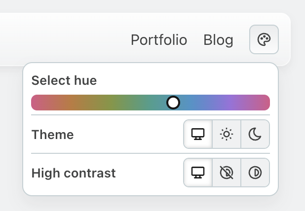
The palette icon in the top bar opens a hue slider. Dragging it rotates the site’s text, surfaces, borders, and accents without @function or JavaScript color math. Underneath is the same pattern I called fragile earlier:
--text-color: oklch(0.201 0.0014 var(--primary-hue));The apparent contradiction disappears because every rotating color stays inside what I call pastel space: chroma remains below the level that fits inside sRGB for every hue at that lightness. Within that boundary, hue can rotate without clipping or overshooting.
The shortcut has three costs:
- Saturation is capped. Pastel space excludes vivid colors.
- Only hue remains dynamic. Tone windows, state changes, and deltas must be baked into static values.
- Each pastel limit must be precomputed. Otherwise, every color needs a CSS function or an impractically large inline calculation.
This blog performs that work at build time, leaving only hue as a custom property. The loophole is useful but narrow: one dynamic axis, muted colors, and precomputation behind the scenes. A production system has to provide that precomputation.
From Experiment to Production

Glaze provides that precomputation layer. It applies OKHST and resolves the palette rules that browsers cannot yet evaluate broadly at runtime. It supports dependent colors, solves WCAG and APCA contrast, handles light, dark, and high-contrast schemes, and exports standard design-token formats.
This blog is a live demo. Glaze generates its hue-rotating UI palette and its syntax-highlighting palette. The dark and high-contrast modes behind the same palette icon are scheme remaps computed at build time: parameter changes rather than hand-authored alternate palettes. tasty.style uses the same approach for its theme variants.
The model also scales beyond a single site. Cube UI Kit, an open-source React library with more than 100 components that powers Cube products, uses one set of Glaze palette rules across its component library. Glaze deserves its own article because it provides a palette-building methodology, not just a color-space implementation.
Closing
The goal is not to make UIs more colorful. It is to make the boring parts of color reliable.
Normalized saturation keeps hue and lightness changes inside a usable gamut. Tone turns movement along the lightness axis into regular contrast steps. Scheme mapping builds those properties into reusable rules for states, dark mode, and high contrast. Glaze precomputes those rules for production today.
OKHST is not perfect or universal, but it gives UI color generation a more useful set of coordinates. The question from the opening is no longer hypothetical: open the palette icon in the top bar, drag the hue slider, and watch the boring parts follow.
